If you’re a designer (or anyone in a similar business), what I’m about to tell you is likely not news, but based on my recent hellish experience, I thought it would still be pertinent to go over this.
The “this” I am speaking of is, of course, why being your own client sucks. It’s a horrible, detestable, deplorable task that is an unfortunate fact of life. Perhaps I am just an awful perfectionist, or just have masochistic design tendencies, but the path I rode to get to my current design was a long, painful, ten month ride.
At first, the project I gave to myself seemed easy: just redesign my site, as I was tired of my old design and it needed some definite freshening up. Seems simple enough, right? Just come up with a new design, code it, and get it online – no big deal.
…But oh how wrong I was. Frankly, I should have known better, as I’ve gone through this trouble of designing for myself before, but sadly I forgot and “history repeats itself because no one was listening the first time.” (—Anonymous)
So without the slightest second thought about the difficulty of the task in front of me, I began on the first design:
 This is from October 2007. I believe I stopped working on this design all of 2 minutes after I began it. As you can probably guess, I dove headlong into working on this one, without any planning. Bad idea! I know better than that, but obviously had a lapse of judgement or I had hit my head on something hard that day. Unfortunately, I can’t remember which…
There isn’t much to this design, so I don’t think there is a whole lot I need to explain here. It sucks, and I dropped it like a hot potato right after (barely) beginning it.
At this point you’re probably thinking, “Am I going to have to look at 30 half-assed designs?” Well, the answer is no; I’m going to keep this to highlights only, since I doubt anyone wants to see 40 very, very minor variations on a single design.
After getting a faulty start, I went back to the drawing board. A month of sketches, thoughts, and concepts went onto little note squares on my desk (more on this in another article).
You should know now (if you don’t already), I love minimalism. Less is more, and all that. Problem is, I have a habit of overthinking things, hence I tend to overwork a lot of my design.
In early December, after some thought and sketching, I came up with the next little gem:
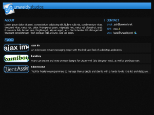 A basic design, three vertical sections (including the header), with a two-column split on the content sections. I spent a decent amount of time tweaking this design, playing with this color, that color, this font, that font, etc. I just didn’t work for me, after playing with it so much. It was too stiff, felt too compact, and the color scheme wasn’t doing a whole lot for me.
Yes, I could have changed the color, and I did…many times. Many, many times. When I start to completely change the color scheme of one of my designs, I know I’m done and have to dump it; at that point, I’ve completely lost whatever vision I had for that design.
So I gave it some more thought, and came up with this next design later that same December. Quite a bit of a different style, but I wanted to play more with type than anything.
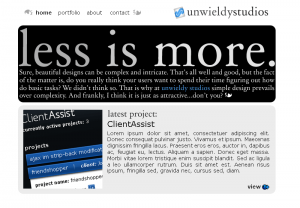 Now, this design is better than my last one; at least, in my opinion (and that’s what matters during this process). Unfortunately, though, it just didn’t feeel very cohesive. The elements didn’t mesh very well…they each felt like their own little islands that just happened to be floating close to each other.
I dumped this design. Again.
What did I get out of this design? That oversized, serif type looks really nice when set well and combined with smaller type (both serif and sans-serif). Unfortunately, I didn’t get this when I dumped the design, so I began moving in the wrong direction.
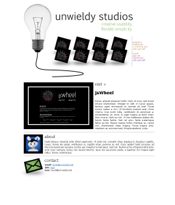
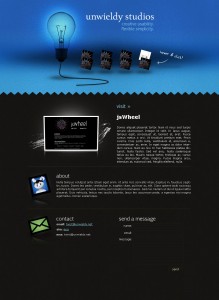
Personally, I happen to like the concept of these designs. There was movement to them: the lightbulb was intended to slowly bounce up and down like a balloon; the angled squares would be links to various projects, and when clicked they would glide up and fade off (then loading in the bottom rectangle/section). My major hangup with these designs? I felt it was going to be too difficult to implement nicely cross-browser without using Flash (which I do not know), and the moving lightbulb was somewhat distracting. I actually got as far as implementing the header of the first design, and my feelings were very much confirmed – it works great in Firefox, Safari, Opera, but not so great in (can you guess?) Internet Explorer 6 & 7. While I could, in theory, just have accepted the ugly Internet Explorer fate and completed this design, I’m just too stubborn and too much of a perfectionist to let it slide. I am keeping it as an interesting concept though.
After this design, there was a long dry period where I simply came up with sketches, ideas, and concepts when I could, but no real design was done. Then in April of this year, I thought I (finally) had come up with something good:
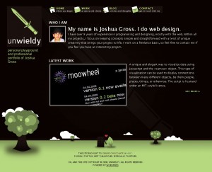 Sadly, I was mistaken. At the time, I liked this design; even mocked up some of the other pages (work, blog, contact). And therein lay the problem: I couldn’t come up with a good way to design the Work page. The most important page, and I couldn’t make it work! After trying to simplify and reduce, it still wouldn’t work right.
I dumped it as yet another failed design.
By now, I was frustrated with my inability to come up with a design I could really appreciate, and blased through five more failures.
Two in June (what was I thinking? Yuck.):
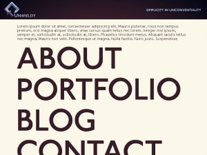
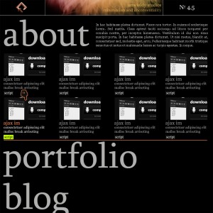
I just want to point something out here: there is a noticable trend from beginning to end. I began with less focus on type, and more on graphics, and as I moved along, type became a more prominent aspect of my designs. This is important, as it allowed me to come to the realization that I was over-working and over-thinking my designs. By focusing on type, it forces me to take a step back and think: Is this image necessary? Is there a better way I can place this element?
Unfortunately, my last design before my “epiphany” was a bit of a regression:
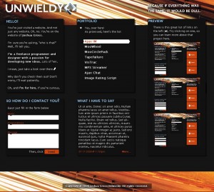 It’s funny, though, with this design, I really thought I had come up with my final design. That is, until I realized how god-awfully packed in everything was. And how dark it was. And how the eye didn’t flow naturally inside the page. And…well, you get the idea. I hated it.
And then I realized: why not just work with type? Let the graphics assist the type, not the other way around. That’s why people visit a site, anyway, right? For the content? And while my site functions as a portfolio, which is mainly graphics-based, the content is equally as important to the visitor.
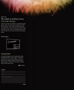
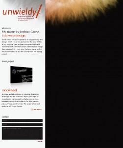
And then, starting from scratch, I came up with this design. It was it…well, as good as it was going to get, considering I hate everything I do.
In the end, what should you take away from this? Designing for yourself sucks. It is a long and arduous process that involves lots of time and many different concepts (if you’re a designer, you should have known this before). This fact is also true of designing for anyone, clients or otherwise.
But you also come away with many concepts than can be used in later projects. While I definitely will not implement any part of my old designs directly into another project, I now have twelve concepts that I’ve learned from. I’ve looked at what did and didn’t work in each, and now can use what did work in future projects.
So I’m my own worst nightmare when it comes to designing for myself, but at least I woke up with a new set of views and a final design.
